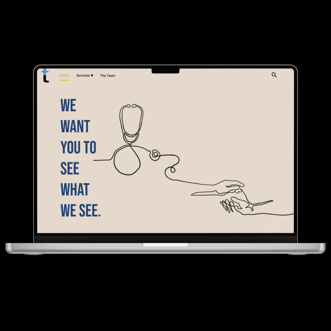
Diagnosing the Real Problem.

Montana Healthcare Transparency.
What is it?
This project aims to make it easier for Montanans to understand and compare healthcare costs. By creating a clear interface, the goal is to help people make more informed choices, without needing a medical degree to read the fine print.

Comparison of prices.
Why?

Healthcare is already stressful and understanding the cost shouldn’t add to it. I took on this project because I believe everyone deserves clear, accessible information when making decisions about their health. Designing for transparency is one step toward restoring trust and reducing anxiety in a system that often feels overwhelming.
The Process
This was my first UX project that I was in charge of and here were the steps I took to create the product we presented at the end of our capstone.

Options of procedures available.


I made a mood board to get a better understanding of colors, emotions, and overall feel of the product.

Final Thoughts
I moved to low-fidelity mockups to focus on structure and flow before refining the visuals.
After refining the structure and flow through low-fidelity mockups, I translated the designs into high-fidelity screens to bring the experience to life.


I then prototyped the screens together into a flow that the user might take.


To design a solution that truly serves real people, I needed to understand their unique healthcare experiences. Personas helped me humanize the data.
I sketched some ideas of screen layouts. It was a low pressure way to test layouts, iterate on user flows, and stay flexible early in the design process with my team.


This was my first big UX project and my capstone at Montana State, and it really shaped how I think about design. I learned how to take a messy, complex problem like healthcare costs and break it down into something people can actually use and understand. There are things I would change today, but it’s a special project to me since it was my first.